Hi lukaswelker,
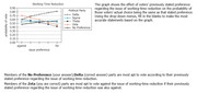
In these types of chart/graph questions, it's important to know what the X-axis and Y-axis represent.
Here, the X-axis is the "preference" for the political idea under discussion (work-time reduction). As you "move" to the left, a voter's stance becomes increasingly "against" the idea; as you "move" to the right, a voter's stance becomes increasingly "for" the idea.
Here, the Y-axis is the probability that a voter will actually vote the SAME WAY as his/her stated preference. The higher "up" the axis goes, the more likely that a voter will be to vote the same way as his/her preference.
The 5 lines on the graph represent 5 political parties. By looking at individual points on each line, you can see the probability of voting a certain way and how it matches up to the particular viewpoint.
1st question: the party that is MOST APT to vote along with its stated preference.....This means we need the highest probability number possible. The biggest number is just above 80 (you can see it in the upper-right corner of the chart) - it belongs to the DELTA party, so that's the answer.
2nd question: the party that is MOST APT to vote AGAINST if its preference is ALSO AGAINST.....This means we have to look as far to the left as possible (that's where the strongest stance "against" the issue occurs) and as far "up" as possible (the highest probability). The biggest number is about 70 - it belongs to the ZETA party, so that's the answer.
GMAT assassins aren't born, they're made,
Rich